
Labs using R: UBC Edition
Lab
4. Graphics
This lab is part of a series designed for BIOL 300, based on The Analysis of Biological Data. The rest of the labs can be found here.
Learning outcomes
Know some basic graphical formats and when they are useful.
Make graphs in R, such as histograms, bar charts, box plots, and scatter plots.
Be able to suggest improvements to basic graphs to improve readability and accurate communication
If you have not already done so, download the
zip file containing Data, R scripts, and other resources for these
labs. Remember to start RStudio from the ABDLabs.Rproj
file in that folder to make these exercises work more seamlessly.
Learning the tools
ggplot()
The function ggplot() allows us to graph most kinds of
data relatively simply. Its syntax is slightly odd but very flexible.
We’ll show specific commands for several types of plots below.
The package that contains ggplot() is confusingly named
ggplot2 (we’ll spare you the backstory). The
ggplot2 package is among the packages within the
tidyverse that you already installed in Lab 2.
Therefore, to use ggplot(), simply load
tidyverse with library(). You’ll see
ggplot2 among the “core” packages listed in the output.
To make a graph with ggplot(), you need to specify at
least two lines in your command. The first line uses the function
ggplot() itself to specify which data frame you want to use
and also which variables are to be plotted. The second line tells R what
kind of graph to make, using a geom_ function. The odd part
is that these two lines are put together with a + sign.
It’s simplest to see this with an example. We’ll draw a histogram with
ggplot() in the next section.
Histograms
A histogram represents the frequency distribution of a numerical variable in a sample.
Let’s see how to make a basic histogram using the age data from the
Titanic data set. Make sure you have loaded the data (using
read.csv()) into a data frame called
titanicData.
Here’s the code to make a simple histogram of age:
## `stat_bin()` using `bins = 30`. Pick better value `binwidth`.## Warning: Removed 680 rows containing non-finite outside the scale range
## (`stat_bin()`).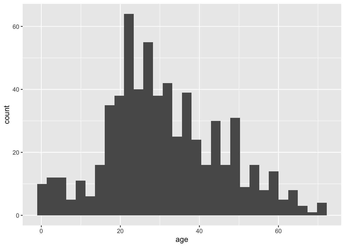
Notice that there are two functions called here, put together in a
single command with a plus sign. The first function is
ggplot(), and it has two input arguments. Listed first is
titanicData; this is the name of the data frame containing
the variables that we want to graph. The second input to ggplot is an
aes() function. In this case, the aes()
function tells R that we want age to be the
x-variable (i.e. the variable that is displayed along the
x-axis). (The aes stands for “aesthetics”, but
if you’re like us this won’t help you remember it any better.)
The second function in this command is geom_histogram().
This is the part that tells R that the “geometry” of our plot should be
a histogram.
This is not the most beautiful graph in the world, but it conveys the information. At the end of this lab we’ll see a couple of options that can make a ggplot graph look a little better.
You may also have noticed the warning “Warning: Removed 680 rows
containing non-finite outside the scale range”. This is a benign warning
telling us that R was unable to plot all data points; 680 of them do not
appear. Run summary(titanicData) and look at the
descriptors of the age column to see why.
A common convention in writing ggplot() code is to drop
a line after each + to get the separate functions within a
plot on their own lines. This is not a requirement (it is feasible to
write the above as
ggplot(titanicData, aes(x=age)) + geom_histogram(), all in
1 line), but dropping lines does often help with readability of the
code. An important reason for this convention of having separate lines
is also because ggplot() itself builds up the plot
layer-by-layer. Successive functions add to or edit things on the plot.
Try running ggplot(titanicData, aes(x=age)) to see how it
looks without the geom_histogram() layer.
Bar graphs
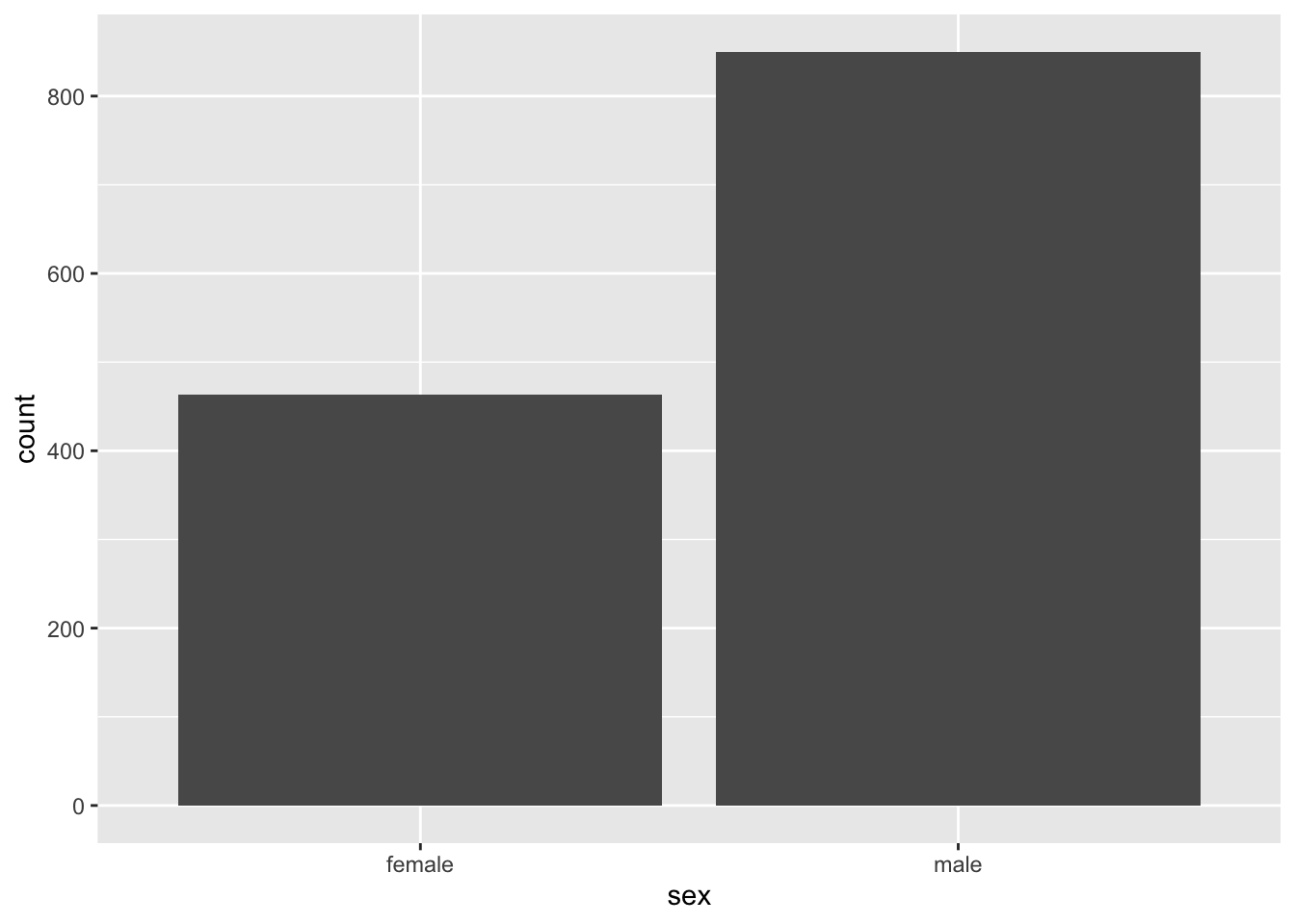
A bar graph plots the frequency distribution of a categorical variable.
In ggplot(), the syntax for a bar graph is very similar
to that for a histogram. For example, here is a bar graph for the
categorical variable sex in the titanic data set. Aside
from specifying a different variable for x, we use a
different geom function here, geom_bar.
Boxplots
A boxplot is a convenient way of showing the frequency distribution of a numerical variable in multiple groups. Here’s the code to draw a boxplot for age in the titanic data set, separately for each sex:
## Warning: Removed 680 rows containing non-finite outside the scale range
## (`stat_boxplot()`).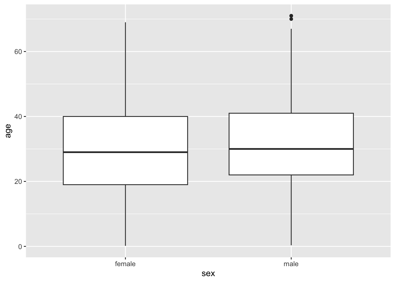
Notice that the y variable here is age, and
x is the categorical variable sex that winds up on the
x-axis. See the result below, and look at where the variables
are. The other new feature here is the new geom_ function,
geom_boxplot().
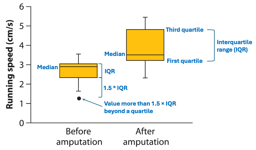
Here the thick bar in the middle of each boxplot is the median of that group. The upper and lower bounds of the box extend from the first to the third quartile. (The “first quartile” is the 25th percentile of the data–the value which is bigger than 25% of the other values. The “third quartile” is the 75th percentile– the value bigger than 75% of the other values.)
The vertical lines are called whiskers, and they cover most of the range of the data (except when data points are pretty far from the median (see section 3.2 of textbook), when they are plotted as individual dots, as on the male boxplot).
Scatterplots
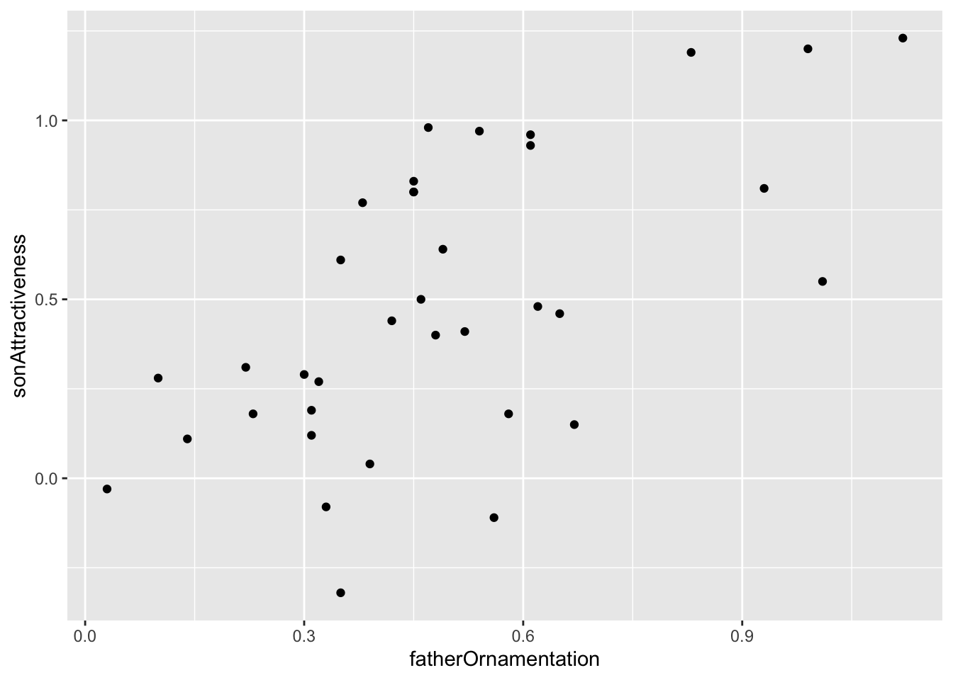
The last graphical style that we will cover here is the scatter plot, which shows the relationship between two numerical variables.
The titanic data set does not have two numerical variables, so let’s use a different data set—the example from Figure 2.3-2 of Whitlock and Schluter, showing the relationship between the ornamentation of father guppies and the sexual attractiveness of their sons. You can load the data for that example with
To make a scatter plot of the variables
fatherOrnamentation and sonAttractiveness with
ggplot, you need to specify the x and y
variables, and use geom_point():
Note that it is possible in R to have a line break between successive
arguments of a function, as we do above (between the x =
and y = arguments). This is is sometimes a handy way to
keep a line from stretching too wide across the screen, but is usually a
matter of preference.
Better looking graphics
The code we have listed here for graphics barely scratches the
surface of what ggplot(), and R as a whole, are capable of.
Not only are there far more choices about the kinds of plots available,
but there are many, many options for customizing the look and feel of
each graph. You can choose the font, the font size, the colors, the
style of the axes labels, etc., and you can customize the legends and
axes legends nearly as much as you want.
Let’s dig a little deeper into just a couple of options that you can
add to any of the forgoing graphs to make them look a little better. For
example, you can change the text of the x-axis label or the
y-axis label by using xlab or ylab.
Let’s do that for the scatterplot, to make the labels a little nicer to
read for humans.
The labels that we want to add are included in quotes inside the
xlab and ylab functions. Here is what
appears:
ggplot(guppyFatherSonData,
  aes(x = fatherOrnamentation,
  y = sonAttractiveness)) +
geom_point() +
xlab("Father's ornamentation") +
ylab("Son’s attractiveness")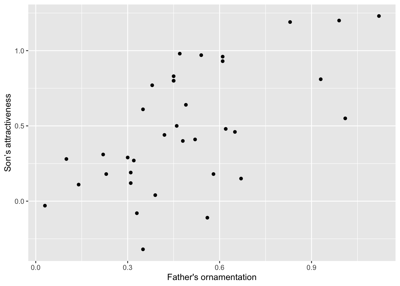
It can also be nice to remove the default gray background, to make what some feel is a cleaner graph. Try adding
to the end of one of your lines of code making a graph, to see whether you prefer the result to the default design.
ggplot(guppyFatherSonData,
    aes(x = fatherOrnamentation, y = sonAttractiveness)) +
    geom_point() +
    xlab("Father's ornamentation") +
ylab("Son’s attractiveness") +
theme_classic()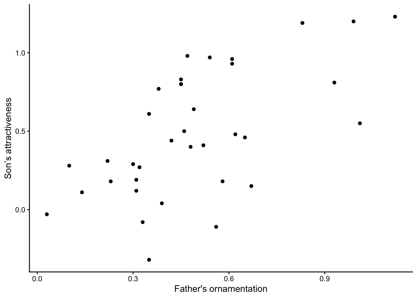
Getting help
The Help pages in R are the main source of help, but the amount of
detail might be off-putting for beginners. For example, to explore the
options for ggplot(), enter either of the following lines
into the R Console (each line does the same thing).
This will cause the contents of the manual page for this function to
appear in the Help window in RStudio. The Arguments section
will name each possible argument that a function can use, and will
detail specifics about how each argument works. Most Help files also
have an Examples section towards the bottom, which often
show worked examples.
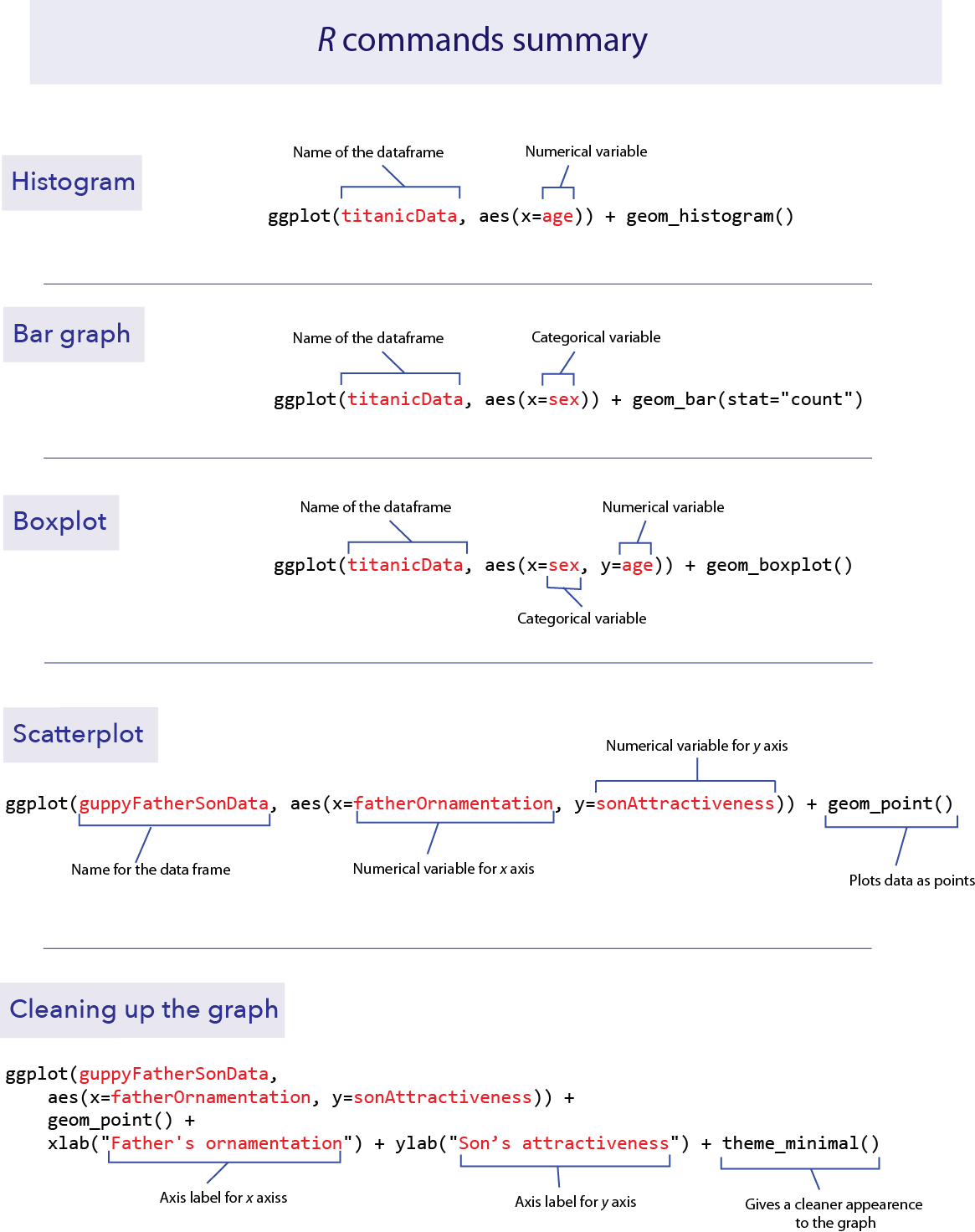
R commands summary
Activities & Questions
Make a script in RStudio that includes all your R code to answer the
following questions. Include answers to all questions below using
comments.
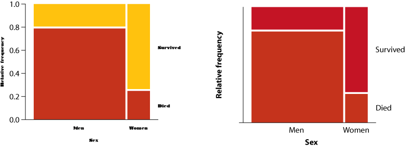
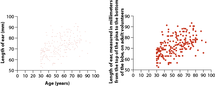
1. For each of the following pairs of graphs, identify features
that communicate better on one version than the other.
- Survivorship as a function of sex for passengers of the RMS Titanic
- Ear length in male humans as a function of age
2. Let’s use the data from countries.csv to
practice making some graphs.
Read the data from the file
countries.csvin theDataForLabsfolder.Make sure that you have run
library(tidyverse). Why is this necessary for the remainder of this question?Make a histogram to show the frequency distribution of values for
measles_immunization_oneyearolds, a numerical variable. (This variable gives the percentage of 1-year-olds that have been vaccinated against measles.) Describe the pattern that you see.Make a bar graph to show the numbers of countries in each of the continents. (The categorical variable continent indicates the continent to which countries belong.)
Create a scatterplot that shows the relationship between the two numerical variables
life_expectancy_at_birth_maleandlife_expectancy_at_birth_female. Note that since the units of measurement in each axis are identical, we recommend adding+ coord_equal()to the end of your ggplot block so that changes in units along each axis are proportional to each other.
3. The ecological footprint is a widely-used measure, developed
at UBC, of the impact a person has on the planet. It measures the area
of land (in hectares) required to generate the food, shelter, and other
resources used by a typical person and required to dispose of that
person’s wastes. Larger values of the ecological footprint indicate that
the typical person from that country uses more resources.
The countries data set has two variables for many countries showing
the ecological footprint of an average person in each country.
ecological_footprint_2000 and
ecological_footprint_2012 show the ecological footprints
for the years 2000 and 2012, respectively.
Plot the relationship between the ecological footprint of 2000 and of 2012. Pay close attention to the scales of each axis (they may differ)
Describe the relationship between the footprints for the two years. Does the value of ecological footprint of 2000 seem to predict anything about its value in 2012?
From this graph, does the ecological footprint tend to go up or down in the years between 2000 and 2012? Did the countries with high or low ecological footprint change the most over this time? Again note that since the units of measurement in each axis are identical, we recommend adding
+ coord_equal()to the end of your ggplot block so that changes in units along each axis are proportional to each other. (Hint: you can add a one-to-one line to your graph by adding+ geom_abline(intercept = 0, slope = 1). This will make it easier to see when your points are above or below the line of equivalence.)
4. Use the countries data again. Fix the mistakes
in the code below to plot the relationship between continent and female
life expectancy at birth. Describe the patterns that you see.
5. Muchhala (2006) measured the length of the tongues of eleven
different species of South American bats, as well as the length of their
palates (to get an indication of the size of their mouths). All of these
bats use their tongues to feed on nectar from flowers. Data from the
article are given in the file BatTongues.csv. In this file,
both Tongue Length and Palette Length are given in millimeters.
Import the data as
bat_tonguesand inspect it usingsummary(). Each value for tongue length and palate length is a species mean, calculated from a sample of individuals per species.Draw a scatter plot to show the association between palate length and tongue length, with tongue length as the response variable. Describe the association: is it positive or negative? Is it strong or weak?
All of the data points that went into this graph have been double checked and verified. With that in mind, what conclusion can you draw from the outlier on the scatter plot?
The function
filter()gives us the row (or rows) of a data frame that has a certain property. Looking at the graph, we can tell that the point we are interested in has a very long tongue length, at least over 80 mm long! The following command will pull out the rows of the data framebat_tonguesthat havetongue_lengthgreater than 80 mm:
The unusual species is Anoura fistulata. See a photo here. This species has an outrageously long tongue, which it uses to collect nectar from a particular flower (can you guess what feature of the flower has led to the evolution of such a long tongue?). See the article by Muchhala (2006) to learn more about the biology of this strange bat.
6. On Canvas, we have added a data set of all recorded
measurements from the first lab from all BIOL 300 students who wanted to
participate. Ensure that you save this .csv in the correct
spot (consult your TA if unsure); we will use this data set again later
in the term, too.
Plot a histogram of head circumference. Do you detect any outliers? Do all the data look as though the same units were used when students recorded them?
One rough anthropometric rule of thumb says that adult height is approximately three times head circumference (each must be measured in the same units). Create a new column in your
data.framethat has head circumference multiplied by 3. Plot the relationship between height and this new variable (again,+ coord_equal()may be advisable here). Do students in our course, collectively speaking, seem to follow this rule of thumb?
7. Pick one of the plots you made using R today. What could be
improved about this graph to make it a more effective presentation of
the data?
Last substantive update: 2026-08-21